Mary found that many of her clients were stumped after their photo shoots—they didn't know what photos to select or how to best display them in their homes, so they sometimes did nothing. Gasp! All of that great photography just sitting there!
So Mary and I brainstormed how we could add value to her clients by offering a design consult in their homes to help them decide where to hang their pictures. It helps clients decide what size pictures to order and ultimately gives them a detailed plan for displaying them.
Our first design challenge took place in the lovely Federal Hill home of Michele Riley. She's had several family photo shoots with Mary, but hasn't figured out the best way to display the pictures in her living room. She bought a tape measure and that's about as far as she got! Here's her living room. The wall on the left is where we're placing the selected photo display.
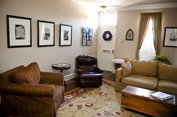
{Living room now. We're planning a photo display for the left wall. Some plans include one of the large Baltimore images shown. Photo by Mary Gardella, Love Life Images}
To begin the consultation, I talked to Michele about what type of display she'd like, symmetrical or asymmetrical. She wanted to try asymmetrical because she said she loves that look, but doesn't know how to do it on her own. Next we looked through the photos Mary took and picked Michele's favorites. We decided to do a black and white display expect for the color shot of her boys on the water. That pop of blue will really stand out among the black and white art.

{Me chatting with the client, Michele, about options and ideas. Photo by Mary Gardella, Love Life Images}
Next I measured the wall we're using and the sizes of the current art. Exciting, I know. Mary makes even the most mundane task look good though!
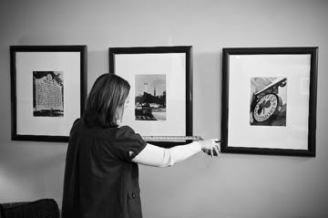
{Me, working the tape measure. Photo by Mary Gardella, Love Life Images}
Once home, I began creating plans to fit the wall using the photos Michele loved, all while sticking within her project budget. Below are the 4 plans we presented to Michele today. Please leave a comment with your vote for your favorite. Voting ends Wed., 3/9 at midnight. The winning plan will be announced here and I will select a name at random from those of you who picked the same plan as Michele.
In addition to using one of her Baltimore art pieces in some plans, I've also included a piece of metal art Michele owns (shown below plans) and suggest, since her family loves the beach, that she add a clear glass wall vase and fill it with sand and shells from their favorite beach (an example is shown below).
In addition to using one of her Baltimore art pieces in some plans, I've also included a piece of metal art Michele owns (shown below plans) and suggest, since her family loves the beach, that she add a clear glass wall vase and fill it with sand and shells from their favorite beach (an example is shown below).
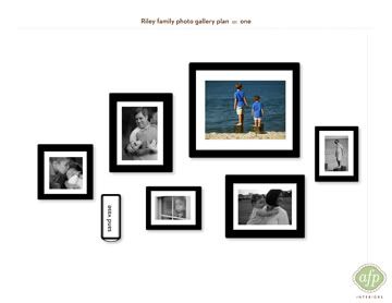
{Plan 1, photo sizes (l to r) - 8x8, 11x14, 8x10, 16x20, 11x14, 8x10}
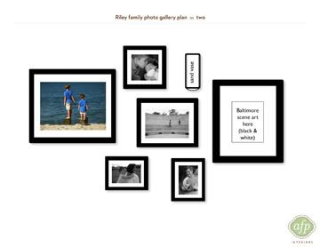
{Plan 2, photo sizes (l to r) - 16x20, 8x8, 11x14, (2) 8x10s}
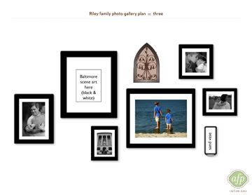
{Plan 3, photo sizes (l to r) - 11x14, 8x10, 16x20, (metal art), 8x8, 8x10}
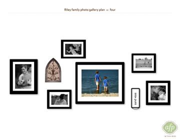
{Plan 4, photo sizes (l to r) - 11x14, (metal art) (2) 8x10s, 16x20, 8x10, 8x8}

{Metal art suggested for wall plans}
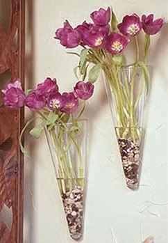
{Example of wall vase for sand and shells}
To be entered to win a lovely set of stationery, please comment and include the plan # you are voting for. Come on, I know you like to share your opinion so please let me know what you think! Voting ends at midnight on 3/9. I'll announce the winning plan, select a winner & contact that winner over the next few days!
Spread the word about this fun project via email and facebook!
Happy decorating!
Spread the word about this fun project via email and facebook!
Happy decorating!


34 comments:
Plan #1
charityd AT centurytel DOT net
I like Plan #2 My eyes kept coming back to that design so that shall be moy vote :) hello to my cousins Bob and Michele Riley :-)
#1 it comes together better than the others
I like Plan #2 I kept looking and looking and my eyes always went back to #2. My vote is cast! PS love the blog!"
Plan #4. I like the color one in the middle with the black and white surrounding it.
I also like plan #2.
Good Luck Michele!
Love, Natalie
Thank you all for voting! You rock. We'll post the client's answer and select a winner tomorrow!
#1 gets my vote - I like the way the eye is drawn to the large color photo and is supported by the surrounding smaller b&w's.
I vote for #3. I like how my eye travels around the collection. (P.S. the security word I had to enter to post this is bordering on obscene! :-)
#2. It's definitely the one my eye was drawn to.
Plan #2. It is a little less linear than #1, which I would like better for a long rowhouse wall. I prefer the frames without the metal art incorporated.
I like plan #2 they all fit nicely in the layout
They are all nice, but I am drawn to # 3 the most. The like that the weight is in the center and how the metal piece provides a natural apex to the overall display. The metal and glass pieces provide texture and visual interest and tension. I might need to "borrow" this for my family gallery at home! :) Love it!
I go with Plan #1!
I like Plan #1. It seems much less random than all the others.
I would skip the Sand Vase of flowers, and find a picture in the same proportion as the black outline your are showing in Plan #1 for the vase. I feel that the vase and flowers will be distracting on a wall of very clean photographs.
I agree with Christine (above) that I like the way the eye is drawn to the color image, with the Black and White images supporting the color picture.
They are all fabulous, and will all look great. #4 kept jumping out at me, so that is what I am voting for
I vote for plan 1.
i vote for plan #4...cleaner look
I like #2.
I love them all - I will have to go with # 4
I like plan #2, kept going back and forth between #2 and #3.... hard choice but I'll pick 2
#2 - i really like flow of the design. Nice job April and Mary. Can't wait to see the final design Michele's home.
I like plan #1. Love how the colored picture is at the top surrounded by the smaller black and white pics. Hope this helps!
I like them all. Plan 2 is my favorite.
I like #2. Seems the wall vase should have a place up top - should provide the best balance.
I like them all, but Plan 2 is definitely my favourite. It seems the most balanced.
I like #1 - easy on the eyes. The downstepping of the photos to the lefft is very interesting.
I like #1 for the simplicity, but will vote for #4 because I think that Michele will want to use her metal art work. I love how the color photo pops against the others being B&W. All of them are fantastic!
Plan 2! I love the balance of the color picture to the left and the many options that the homeowner has for color, texture and height to the right w/ the wall vase. Hanging the vase below a picture frame leaves limitations!
I liked them all.. Plan 2 was my favorite
It took a couple of reviews to figure out why my eye kept going back to 1...I see symmetry in the asymmetrical design. The smaller pictures on the top and bottom of the beautiful, big picture with color are all bw, 2 on top are both in the same direction, as are the 2 on the bottom, w/ one bigger than the other in the same proportions in both places
Thank you all so much for voting yesterday. This was my best response ever! Winner to be announced soon. Please check back to my blog to see the results.
I like plan #1; the blue gives light to the whole concept
Post a Comment