House Calls is one of my favorite features in Thursday's Washington Post, so I was honored to redesign a master bedroom in yesterday's paper. Click here to see the before and after images and my solutions to this great space.
Do you want a little peek behind the scenes of this project? I thought so!
The Post connects homeowners and designers and the two never communicate directly to each other, all correspondence goes through The Post. They send the designer pictures of the room and the challenges that the homeowner is having with the space.
There's a budget (see, it's like real life) and the homeowners usually have items that they want to keep or things that will inspire the decor. In the case of the master bedroom design, the homeowner had a treasured piece of art that I had to build the room around. Again, like real life!
I started this room by selecting the bedding because the bed is the featured and largest piece in the room. Once the bedding was selected, all other decisions came from the colors in the art. My final decision was the paint color, Silver Dollar, a lovely grey from Benjamin Moore, for the walls and BM's Metro Gray for the ceiling.
One of the homeowner's biggest challenges are the off-center windows. I added fabric along the back wall to add softness and disguise the window. Adding fabric is a great way to add softness to a room.
Then they wanted a way to section off the small sitting room that is part of their bedroom. Again, I went to fabric to divide the spaces. You can block as much as you want with this solution, depending the fabric you select.
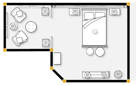
The final rendering only shows one part of the room, but I developed a floor plan for the entire space, as well as selecting all pieces shown (aside from their existing bedroom set).
Here's the overall plan.

skip to main |
skip to sidebar

{decorating e-book -- subscribe to my e-newsletter to receive your copy!}
Twitter

 Posts
Posts

 Posts
Posts
Followers
Contact April
subscribe to my e-newsletter & receive my FREE decorating e-book

{decorating e-book -- subscribe to my e-newsletter to receive your copy!}
subscribe via feed


Featured on houzz.com!
Browse Window Treatments on Houzz- For Example:


2 comments:
Awesome job April! You are really great at what you do.
This was so great!!
Post a Comment