
Mary came up with the idea for the design challenge when she discovered that many of her clients were stumped after their photo shoots—they didn't know what photos to select or how to best display them in their homes, so they sometimes did nothing. They were stuck and needed help.
Mary and I brainstormed how we could add value to her clients by offering a design consult in their homes to help them decide where to hang their pictures. It helps clients decide what size pictures to order and ultimately gives them a detailed plan for displaying them.
For our second design challenge, Mary and I are working with a shared client, Tamara Jensen. I've been working on design projects in Tamara's home for the last year and a half and Mary has taken photos of her family, so she became our perfect design challenge #2!
Tamara is now redesigning her living room so we decided a wall design was in order for this room.

{Living room now, before redesign and with temporary art that motivates them to obtain new art! This is the wall where we'll hang the photos. Photo by Mary Gardella, Love Life Images}
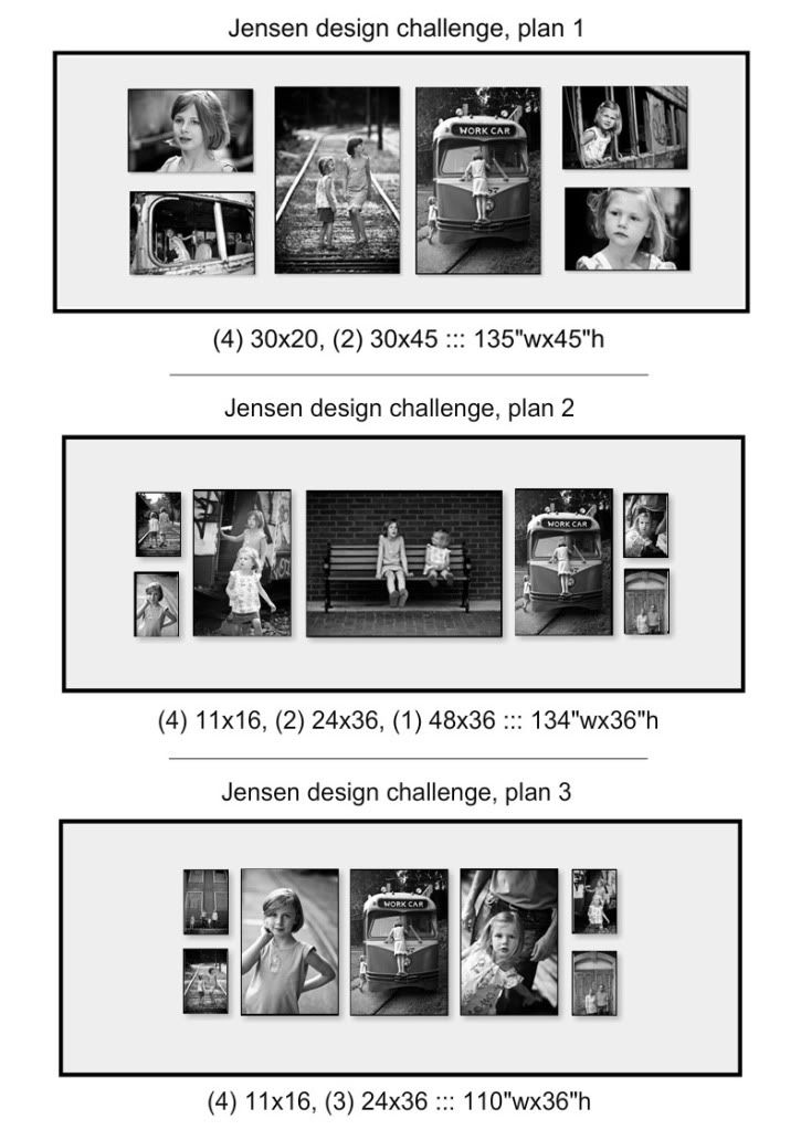
During the consultation, we discussed that Tamara wanted clean lines for her design. She wants the living room to be calm. Next we looked through the photos and picked Tamara's favorites. We decided to use box frame with black and white images of the family. Box frames are similar to canvas wrapped frames, but made out of wood with black sides. Stunning!

{Planning the perfect wall design. Photo by Mary Gardella, Love Life Images}

{New space plan for the living room (the art will be displayed on the left side of the page). Photo by Mary Gardella, Love Life Images}
Once home, I began creating symmetrical plans to fit the wall using the photos Tamara loved. Below are the 3 plans we presented to Tamara. Please leave a comment with your vote for your favorite. Voting ends Tues., June 29 at noon. The winning plan will be announced here and I will select a name at random from those of you who select the same plan as Tamara.

To be entered to win a lovely set of stationary please comment and include your name, a way to contact you and the plan # you are voting for. Come on, I know you like to share your opinion so please let me know what you think! Voting ends at noon tomorrow, June 29. I'll announce the winning plan, select a winner & contact that winner over the next few days!
Spread the word about this fun project via email and facebook!
Happy decorating!
Spread the word about this fun project via email and facebook!
Happy decorating!


11 comments:
FUN! I love all of these options, but I think #2 is my favorite. What great photos and what a great idea for a living room wall!
xo Sarah
Hi April!
Great options! My fave is #1, I like the fact that they are all BIG, I think that will make a huge impact in the room!
Great job!
Have a beautiful day~
;-D Kathleen
Thank you ladies! The images make them all wonderful. It will be difficult for the client to make the final call!
A vote for the layout of #1 but with the center image from #2. Agree with the comment that BIG works better for that room. Smaller would be fine in a dining room or hallway set.
In #1, top image on the left is looking out of the frame, which draws the viewers' eyes away. Otherwise it's a great capture. The right side composition is stronger in #1. Maybe switch the top right and left images for each other.
In #2 center bench image, suggest a bit of enlargement and crop top and bottom to make the subjects a bit bigger.
Just an anonymous opinion. If I win Tamara can have the prize.
#2 catches my eye the most. I am drawn to the "Big Picture" in the middle and then it makes me want to explore the other pictures on each side! Great Job!!
I think the size of the pictures in #1 make it the best choice, although I liked them all.
I agree with anonymous - "I vote for the layout of #1 but with the center image from #2."
BTW - what color is the green wall? I need a green color, leaning towards more blue. Help?
My vote goes to Layout #2, love the little girls on the bench centered on the wall.
More thoughts from Anonymous...
1. I think the theme here is sisters, and that message is conveyed better with both girls together in a single central pic. Otherwise it's "my side" and "her side." Just like kids kept apart in the back of a minivan.
2. The bench pic is nice because they clearly "pop" visually against the darker brick background. And it's nice that she's looking up at her big sister.
3. I think the shots with the parents don't work as well visually because the subjects are relatively small visually. Suggest framing them separately as alternatives for other locations.
4. Counting across, having an odd number of photos, i.e. a clear center shot, ties the composition together better.
5. Of the pix in #1, I think the best captures are top left, top and bottom right (especially the bottom one), and the left vertical 2 on the tracks. Of the pix in #2, besides the bench pic, the 2 exiting the trolley is also really nice.
6. So I'd take those and figure out a way to balance them visually on either side of the center.
Just my 2 cents.
This design challenge is really a great way to put in to practice all the skills and knowledge the designers have. I am very pleased with the wall art you are planning to do. I wish you good luck for this challenge!
The images are really lovely. Your photos are really something. I'll keep visiting for more of your posts.
Post a Comment