I'm working on a few design projects for a client in Columbia, MD right now that showcase how to use the details in your space to create a unique and complete look. The projects are not finished yet, but we began by selecting a paint color for her kitchen, Sherwin-Williams' Copper Harbor.
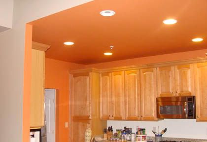
{Copper Harbor in the kitchen. The client has a lot of royal blue, yellow and orange pottery so this color was a great tie in, ceiling and all!}
Next we selected tiles for her back splash (still be installed). Here's what we're working with.
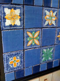
{Bright colored tiles to match her pottery and the walls}
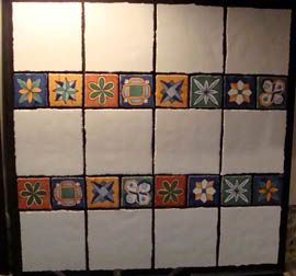
{Pretty detailed tiles in a smaller size to add interest to the layout}
In order to help the client figure out a pattern for the back splash I did a to-scale drawing to help her "see it." We then ordered the tiles and laid them out on the dining room table in the final layout, ready for installation.
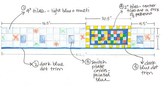
{Drawing to show the back splash layout. Sketches are great because you can change them up and play with options before ordering the product. This reduces surprises when the tiles are installed.}
We are due to install these soon and I'll send you a picture when all is complete.
Next, the client wanted to do a decorative treatment on her dining room walls -- two walls that are adjacent the kitchen. One wall is a half wall, leading right into the kitchen, so we had to take the kitchen design into consideration when we made dining room painting selections. Here's where the details of the kitchen come into play!
Decorative artist, Dee Cunningham, owner of Deelite Design, consulted with me and the client to come up with a great decorative treatment that incorporated a design from the tiles and the color from the walls. When in doubt, look at what you have and love in your space and base future decisions on those details.
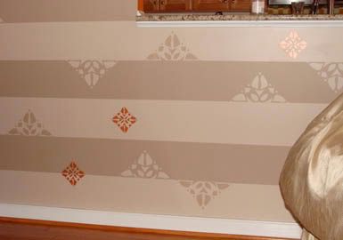
{Decorative treatment on the dining room walls, which opens to the kitchen. In order to tie the kitchen into this treatment I suggested we incorporate the orange color. Dee brought in the orange in an iridescent glaze and mimicked the pattern on one of the tiles in the accent shape. Perfect!}

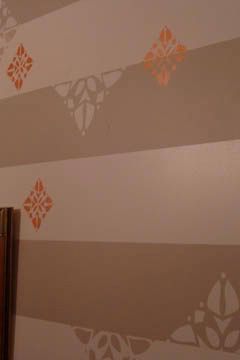
{This view shows you the shimmery quality of the iridescent orange details.}

{Bright colored tiles to match her pottery and the walls}

{Pretty detailed tiles in a smaller size to add interest to the layout}
In order to help the client figure out a pattern for the back splash I did a to-scale drawing to help her "see it." We then ordered the tiles and laid them out on the dining room table in the final layout, ready for installation.

{Drawing to show the back splash layout. Sketches are great because you can change them up and play with options before ordering the product. This reduces surprises when the tiles are installed.}
We are due to install these soon and I'll send you a picture when all is complete.
Next, the client wanted to do a decorative treatment on her dining room walls -- two walls that are adjacent the kitchen. One wall is a half wall, leading right into the kitchen, so we had to take the kitchen design into consideration when we made dining room painting selections. Here's where the details of the kitchen come into play!
Decorative artist, Dee Cunningham, owner of Deelite Design, consulted with me and the client to come up with a great decorative treatment that incorporated a design from the tiles and the color from the walls. When in doubt, look at what you have and love in your space and base future decisions on those details.

{Decorative treatment on the dining room walls, which opens to the kitchen. In order to tie the kitchen into this treatment I suggested we incorporate the orange color. Dee brought in the orange in an iridescent glaze and mimicked the pattern on one of the tiles in the accent shape. Perfect!}


{This view shows you the shimmery quality of the iridescent orange details.}
Making decisions in the design process requires careful planning and careful review, but it also involves taking details into account and using the ones you love to create a beautiful space. Open your eyes and see the details around you!
Happy decorating!


3 comments:
It looks like you have created a very fun and unique design for your client! Great job, April! I'm looking forward to the "after" pics!
and...happy Mother's Day!
;-D Kathleen
Ooh, this looks great! I especially love that wall treatment in the dining room. Very elegant and fun. Can't wait to see the finished project!
Thank you both for your comments and I too can't wait to see the finished project!
Post a Comment