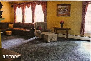
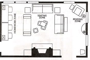
This is a great example of how you can divide a large, long room into "zones," based on the room's functions. In this case there's an area for kid's homework, watching TV and a reading corner.

Before, a sectional against the wall, in the corner, far away from the fireplace in the center of the opposite wall.

After, floor plan with three "zones" - homework, hanging out/tv and reading
(From Feb. Better Homes and Gardens mag, design by Elaine Griffin.)

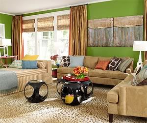
After, style meets function. A new seating area, in a "U" shape, in the center of the room.
(From Feb. Better Homes and Garden mag, design by Elaine Griffin.)

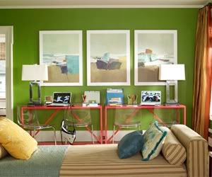
After, the chaise acts as a divider between the seating and homework areas, but its low profile keeps the space open.
(From Feb. Better Homes and Garden mag, design by Elaine Griffin.)
How can you better utilize your sofa and your space?
Happy decorating!


1 comment:
Awesome Idea!
Really within the space adjusting sofas in new styles is amazing because Sofa takes lot of space so many avoid stylish sofas which need more space. Happy to come across such a great site. The above provided information with a ideal plan is great. Hope to follow this plan if possible.
Thanks for sharing.....
Post a Comment